August 25, 2015
| ksykes
| Services
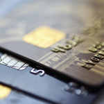 A credit card processing company came to us with an idea for its new business card—one that looked like a credit card. We brought our expertise in design, materials and printing techniques to bear. The result? A plastic business card in all appearances, front and back, identical to a standard credit card. But information the card carries is personalized to the card owner. On the front, in the normal location for the account number, is the card owner’s phone number—embossed and silver-tipped. Lower left corner, the card owner’s name and additional contact information. And included on the back are both the standard white signature strip with the card owner’s signature and an inert magnetic strip. The most logical ideas often aren’t the easiest to execute but can really make the brand stand out.
July 20, 2015
| ksykes
| Services
 Investment means paperwork. For investors in oil and gas, this can mean lots of paperwork—for example, multiple packets of stapled subscription documents for a single investment. This can really feel like a hassle to an investor, so we worked with one of our oil and gas clients to simplify things. We reengineered our client’s subscription documentation into a single, easy to understand and complete investor’s booklet. No more packets, no more staples. Just a handsome 11X17 “magazine” that’s user friendly and brand enhancing. An improved experience for our client’s investors. A simple solution that differentiates our client.
June 29, 2015
| ksykes
| Services
 A major sports franchise launched a new business and wanted a distinctive look, with a blind embossed business card also printed on the back. Printing over blind embossing doesn’t work. But we found an answer. We laminated heavy card stock with contrasting team colors to the back of the business card shells and printed both sides. We always find a way to meet our clients’ needs.
May 25, 2015
| ksykes
| Services
 Direct mail has a bad rap. Maybe deserved, if it’s poorly designed, improperly targeted and badly executed. Done well—right message, right medium, right audience, right time—direct mail is a growth driver. That’s why so many of our clients look to us for help with their direct mailing campaigns, from soup to nuts: purpose, message, audience, design and layout, medium, and delivery. Response rate is typically about 3%, but we’ve seen as high as 15%. Recently one of our home healthcare clients came to us, looking to grow its number of high net worth patients. We worked closely with our client to develop the mailer message, design, and look and feel. As important, we carefully and thoughtfully identified recipients. Zip codes and home values were only two of our selection criteria. The result? A well-crafted message delivered to a specific, qualified audience that’s supporting the growth and success of our client.
April 13, 2015
| ksykes
| Services
 A long established client came to us for help after taking up a new career—painting. He wanted to mass produce his best selling works, and we really wanted to help him because we value every relationship we have. We identified a production process and teamed with a vendor to frame the canvases. A happy client and a new process for us…a win-win.
March 23, 2015
| ksykes
| Services
 A commercial property management client decided to rebrand in connection with a new, high-end property in downtown Dallas. We started with a fundamental: the client’s business card. A design-must for the card included a truly distinguished presentation of the client’s identity. Embossing or thermography just weren’t enough to create that raised, almost iridescent look we needed. Our solution: the incorporation of a spot UV coating over the client’s name to create both distinctive texture and visual “pop”. A high-end business card perfectly suited for a high-end property manager.
 A credit card processing company came to us with an idea for its new business card—one that looked like a credit card. We brought our expertise in design, materials and printing techniques to bear. The result? A plastic business card in all appearances, front and back, identical to a standard credit card. But information the card carries is personalized to the card owner. On the front, in the normal location for the account number, is the card owner’s phone number—embossed and silver-tipped. Lower left corner, the card owner’s name and additional contact information. And included on the back are both the standard white signature strip with the card owner’s signature and an inert magnetic strip. The most logical ideas often aren’t the easiest to execute but can really make the brand stand out.
 Investment means paperwork. For investors in oil and gas, this can mean lots of paperwork—for example, multiple packets of stapled subscription documents for a single investment. This can really feel like a hassle to an investor, so we worked with one of our oil and gas clients to simplify things. We reengineered our client’s subscription documentation into a single, easy to understand and complete investor’s booklet. No more packets, no more staples. Just a handsome 11X17 “magazine” that’s user friendly and brand enhancing. An improved experience for our client’s investors. A simple solution that differentiates our client.
 A major sports franchise launched a new business and wanted a distinctive look, with a blind embossed business card also printed on the back. Printing over blind embossing doesn’t work. But we found an answer. We laminated heavy card stock with contrasting team colors to the back of the business card shells and printed both sides. We always find a way to meet our clients’ needs.
 Direct mail has a bad rap. Maybe deserved, if it’s poorly designed, improperly targeted and badly executed. Done well—right message, right medium, right audience, right time—direct mail is a growth driver. That’s why so many of our clients look to us for help with their direct mailing campaigns, from soup to nuts: purpose, message, audience, design and layout, medium, and delivery. Response rate is typically about 3%, but we’ve seen as high as 15%. Recently one of our home healthcare clients came to us, looking to grow its number of high net worth patients. We worked closely with our client to develop the mailer message, design, and look and feel. As important, we carefully and thoughtfully identified recipients. Zip codes and home values were only two of our selection criteria. The result? A well-crafted message delivered to a specific, qualified audience that’s supporting the growth and success of our client.
 A long established client came to us for help after taking up a new career—painting. He wanted to mass produce his best selling works, and we really wanted to help him because we value every relationship we have. We identified a production process and teamed with a vendor to frame the canvases. A happy client and a new process for us…a win-win.
 A commercial property management client decided to rebrand in connection with a new, high-end property in downtown Dallas. We started with a fundamental: the client’s business card. A design-must for the card included a truly distinguished presentation of the client’s identity. Embossing or thermography just weren’t enough to create that raised, almost iridescent look we needed. Our solution: the incorporation of a spot UV coating over the client’s name to create both distinctive texture and visual “pop”. A high-end business card perfectly suited for a high-end property manager.